Three months ago, I was talking to my friend about how I'd like to eventually work in the nonprofit organization (NPO)/non-governmental organization (NGO) space. I've been working on the cutting edge of technology and software for a while, and all I saw every day was how much potential technology had for impact. But, how would I ever enter this space with no experience working with NPOs and NGOs? How could I make an impact if I didn't first understand the industry? That's when my friend told me about the AIGA Seattle Design for Good Changemaker Series and how professional project managers (PMs) and designers could volunteer their time to help local nonprofits in the area. I was intrigued and decided to give it a shot. And here I am, three months later.
On the first days of the Changemaker Series, I met with five other kick ass women on my team and we were told that we would be working with Real Change, a local nonprofit organization that worked on providing low barrier employment opportunities via the sale of a social justice newspaper. To sell this street newspaper, all one had to do was attend a 90 minute training session and practice selling five test copies. I loved it. It was a great idea; it gave back to the community and delivered value to the buyers of the newspaper. It turns out, this organization needed help increasing the readership of their newspaper. It sounded like a daunting task. Increasing readership of a print newspaper in the time of digital media? Wow. Ok.
Fortunately, there is a digital copy of the newspaper available via an app. A customer simply had to scan the badge of an authorized newspaper salesperson to get the latest weekly copy of it. Phew! So we got started asking some basic questions:
- Who reads the newspaper today?
- Where are these newspapers sold?
- What characteristics should a potential reader exhibit?
With this initial line of questioning and research, we had three big observations to help us scope our problem statement:
- The average readership of Real Change is aging
- Real Change has limited digital presence
- Younger people get their news from digital media (predominantly Facebook)
These three observations got us to scope our initial problem statement to:
How can we increase readership of Real Change among millennials in Seattle?
Ideation
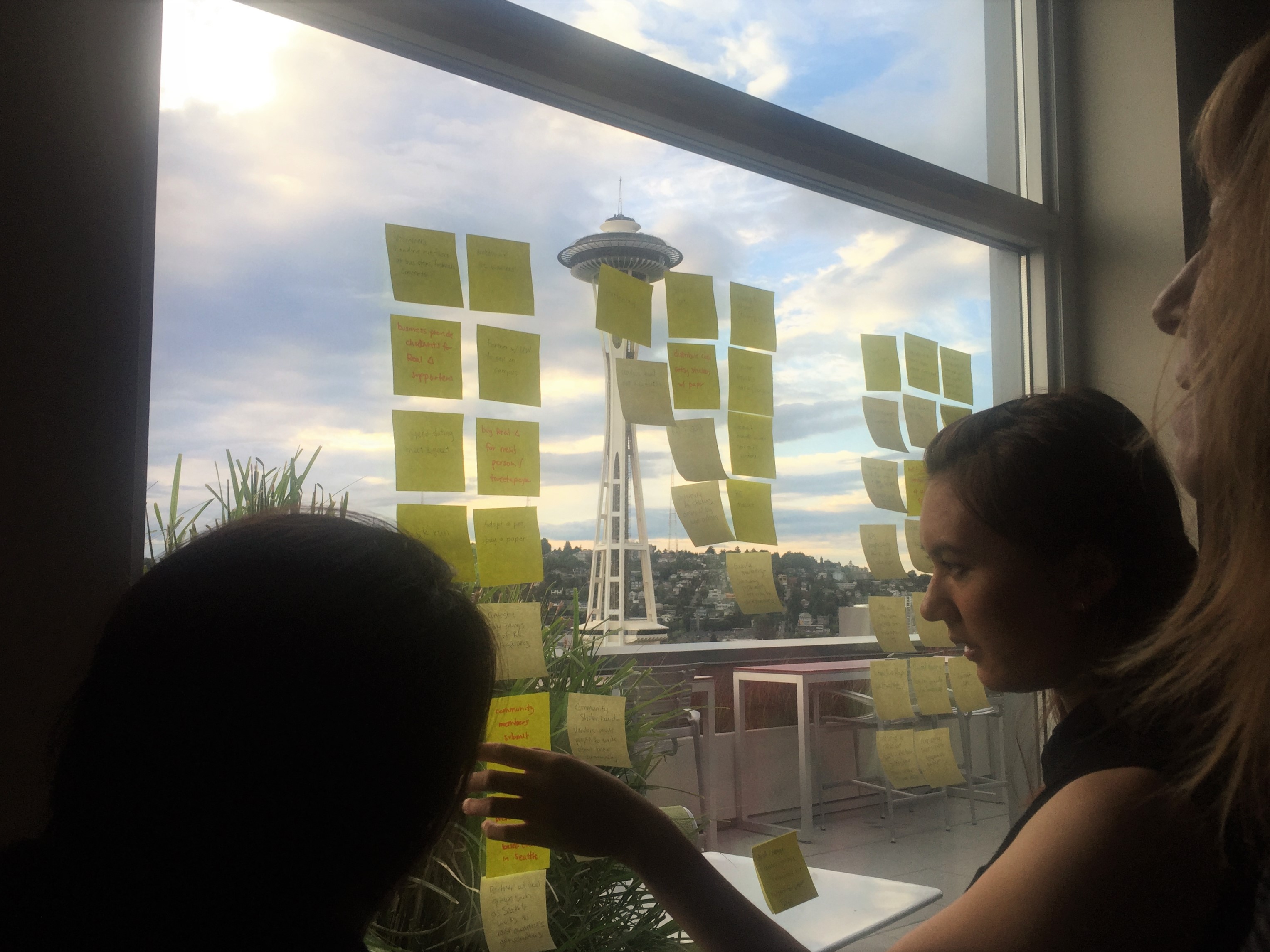
With our scoped problem statement in mind, we tried to think of ideas that would get us to read a newspaper. Our team was composed largely of millennials - all we had to do was reflect on the last time something got us interested in a new product or idea. To avoid getting too siloed in our efforts, we also consulted our favorite pal for more ideas: the internet. Our ideation phase ended with a trove of ideas, and we knew we had to cull this list down to a manageable amount. We chose to cut any ideas that required too much time, too much effort, required too much coordination or cost too much time/money to test. We then broke these ideas into two groups: ones we could deliver, and ones we could recommend as best practices to attract millennial attention:
Deliverables
|
Ideas to recommend
|
- Creating a social media ad campaign with collectible Buttons/Stickers
- Facebook ads
- Flyers
- Posters
|
- Organizing community events targeted at millennials
- Recycling existing digital articles into Facebook posts or subscriber newsletters
- How to automate various social media and email tools for broadest reach across millennials in Seattle
- Improving SEO for the Real Change website
|

Pre-Prototyping
Now, let's get to the heart of this post: How did we prototype and test our proposed deliverables for Real Change? Well, it was difficult. We're a team of ambitious women, and we wanted to deliver something of value by the end of the project. We wanted it to be more than just a bunch of ideas. We wanted to provide a tried and tested tangible solution that was sure to make an impact.
We decided the best way to go about this would be to get even more focused on fewer solutions. To do that, we did the most counterintuitive thing first. We took a step back, looked at our deliverables and asked ourselves some more basic questions:
- Why? Why are we even testing this prototype or form factor? What are we looking to learn?
- What? What would we need to make this prototype? e.g. materials, cost, dimensions
- Where? Where would this deliverable or solution typically be placed? Where would be the ideal place to test it?
- When? Would this solution typically be distributed during an event or a specific time of day?
- How? Once we've created this prototype, how will we test it? How would we know that it was effective?
- Feasibility: Do we have enough time? Enough people? How does the cost-benefit work out for this?
Once we reflected on these questions, we cut out more solution ideas.
The social media campaigns and ad campaigns targeted at millennials with buttons + stickers would require too much time to test and would have required coordination with multiple digital assets. As for the posters, we found out that the cost and the circulation channel for the poster form factor didn't meet our cost benefit analysis. On top of that, there was no clear channel for us to test that posters worked.
We were now down to just Facebook ads and flyers. Facebook ads came out on top through this questioning process. It provided us the most flexibility as a prototyping and testing channel while allow us the space to put our design ideas to work. Plus, the images we had to make for Facebook ads would end up being the same, if not, similar to what we'd want to put on the flyers anyway. We wanted to prototype at least one idea in a physical form factor (flyers) so the RC team to have something to hand out that targeted millennials at events or event booths.
And then we started prototyping!
Not so fast…
The Unexpected Prototype
While we had expected to prototype Facebook ads, what we hadn't thought about was: the call to action. Once clicked, where would our Facebook ad lead? We planned on having just enough information on the ad to get potential readers click on it. Which meant, our target audience would need more information on the organization and guidance on what their next steps would be. The current Real Change Facebook page, website, news page and their other social media accounts didn't have a page dedicated to this. This is when we realized, we'd have to create our own landing page to call out why someone should choose to support Real Change. We wanted to provide information on what was in it for them and how they were giving back to the community by supporting this organization. During our initial interview phase, we found that a lot of millennials in the Seattle just didn't know enough about the brand. Once we told them during our interview, social justice minded individuals did a complete 180 and they were excited to support this organization. This is impact we were trying to have with the landing page.
Prototyping
Facebook Ad
Our design team brainstormed a wide spread of images and typography. Their ideas ranged from focusing on the news, to the vendors, and even photos of millennials reading Real Change.
At this point, we realized, if we wanted valuable data on how well our prototypes would test, we'd need some solid hypotheses on what would resonate with our target audience. We chose three main focus areas or hypotheses for our ads:
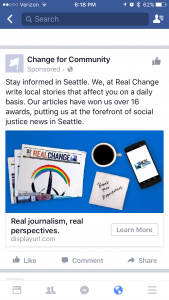
- Millennials in Seattle are interested in news from local news sources. Emphasizing that Real Change is an award winning news source will generate click throughs.
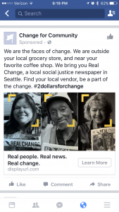
- Millennials in Seattle are interested in the story behind the people selling Real Change. Humanizing the voices of vendors that sell Real Change will generate click throughs.
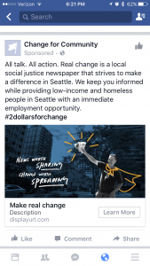
- Millennials in Seattle are interested in how to make the biggest impact in their community. Emphasizing how supporting Real Change can affect change will generate click throughs.
Once we had the designs we thought worked well, we started generating copy that aligned with our hypotheses. We iterated on the image and copy combinations based on feedback from within the team, our Real Change client and other Changemaker2016 participants. Finally, we pared the combinations down to three that we felt represented the hypothesis accurately.


Landing Page/flyers
The copy we needed for this landing page matched up with the content we wanted to create for the flyers. We decided that the direction we picked for the landing page, would be how we set up the flyers. They were both intended to convey similar information, and it would help us save time to consolidate the design and content for the two form factors.
We first started out by brainstorming different layouts and how we would organize messaging on them. Similar to how to treated our Facebook ads, we sent our landing page and flyers through a few rounds of surveying and preliminary testing, by asking teammates, our RC client as well as the Changemaker2016 participants. We then nailed down the layout; it had to be something that worked well on a mobile browser and all of our test ads were targeting mobile devices. With the layout complete, we added a short summary of the Real Change organization, and five call-to-actions of varying difficulty:
- Buy a real change newspaper
- Get the app if you don't have cash
- Subscribe to the newsletter
- Like us on social media
- Read our latest issue
Ready for test flight
Hypotheses? Check. Ad prototypes? Check. Landing page? Check.
We were ready to start testing. With all of the initial hard work done, I was suddenly apprehensive. Did we really have enough time? Would any of our images and copy be good enough to get ad clicks? Before I could continue down my nervous spiral, I realized that we still had to coordinate launching these test ads via the Real Change Facebook page. It took us an extra week the get the credentials, budget and payment methods in order. Once we did, we decided to meet in person to push the big red button.
When we met to do so, we collectively held our breaths before we put in our order for the Facebook ad. We were live. We all looked at each other with big smiles. It was finally happening! We would finally get some data on how effective our designs and copy were. And then I immediately started compulsively refreshing the Facebook ad page to see if anyone had clicked anything yet. It turned out that it would be another couple of hours before the first trickle of clicks started flowing.
At this point, we're still waiting for our complete set of results to roll in.
Empathy
Throughout this whole process, another lesson we learned was how to develop empathy with the parties involved in the project. When we wanted to test Facebook ads on the Real Change Facebook page, we needed to make sure the tone of the copy and image matched the brand image and mission. When we needed to make decisions as a team, we needed to make sure all our voices were accounted for and that we weren't leaving any of our remote team members behind. When we were testing ideas that involved featuring vendor profiles, we needed to take into account how the vendors would feel. This last point had been the most interesting lesson of all. Our client had noted to us that time and time again, vendors did not like being perceived as "the homeless who needed help" but rather as people who overcame the odds and were trying to work for an honest living. They were people who were dealt one of the hardest hands life could deal and yet they fought to be employed, and being employed as part of Real Change is what they want to be recognized for.
By the end of this project, my team and I had developed an utmost respect for the vendors, the Real Change organization, and all the people in the NPO and NGO space who strive to make the world a better place.
With all this in mind, I want to thank the Changemaker Series organizers, and the Real Change organization for providing me this opportunity to learn and help make an impact. I am now ready to take the next step towards my goal of working for an NPO or NGO.